Overview
The Challenge
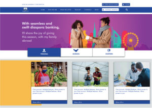
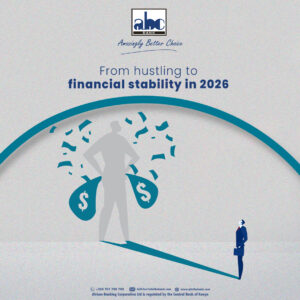
- Homepage led with an internal announcement (award news) instead of a customer value proposition
- Viewing accounts under each banking type (Personal/Business/Diaspora) required navigating away to a separate page
- Compliance and legal content (Cost of Credit, Data Protection, Key Facts, CRS, FATCA) was stacked as long-form text, making the page extremely long to scroll through
- Low text contrast on photo-heavy cards affected readability
- Hero banner sat as an inset block with page background visible around it, weakening the first impression
- No visible account/login actions until deep in the nav
Goals
- Lead with customer value, not internal messaging
- Let visitors explore accounts under each banking type without leaving the homepage
- Cut down page length without removing information
- Improve legibility and visual consistency across cards
- Give the hero a stronger, more immersive first impression
- Surface primary actions (open account, log in) earlier
Key Changes
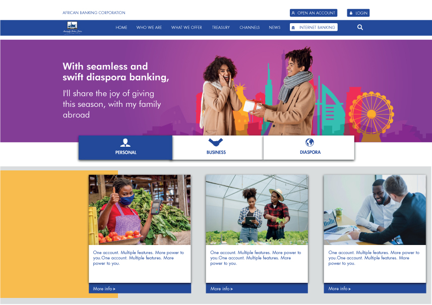
- Replaced the award-announcement hero with a story-led, customer-facing message, and extended it to full-bleed (edge-to-edge) so it reads as a proper statement banner instead of an inset content block
- Converted the three separate “Get Started” links (which previously navigated to a new page per banking type) into an inline segmented tab selector with an expand indicator — visitors can now browse the three accounts under Personal, Business, or Diaspora directly on the homepage, without leaving the page
- Restyled cards with a plain white info panel instead of overlay text on photos, for consistent readability
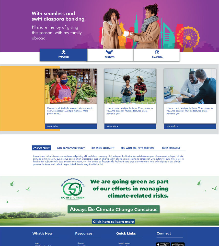
- Consolidated five separate compliance sections into a single tabbed panel
- Added persistent “Open an Account” and “Login” actions to the top bar
- Simplified the sustainability banner to one headline and CTA
- Added app-download and social links to the footer
Outcome
A shorter, more scannable homepage that lets customers explore their banking options faster — without leaving the page — and reduces the scroll needed to reach compliance information, without cutting any content.